
Ecommerce and Retail • Ecommerce Design

As the digital storefront to your ecommerce business, a website can quite seriously make or break your business. In this article, we’ll guide you through some of the key design elements you should consider for a successful website and some great examples of Neto retailers who are getting it right.
As a business owner, you’re heavily invested in your business and the goals you need to achieve, but when it comes to marketing, the focus shifts to your customer - the benefits you can offer them and the problems you can fix for them.
This approach needs to be front and centre when it comes to designing a website.
Customers expect an experience that’s engaging, inspiring, slick and easy.
In the design world, it comes down to two vital elements UI (User Interface) and UX (User Experience). Put simply:
Let’s cover off some key UI elements to give your website the edge…
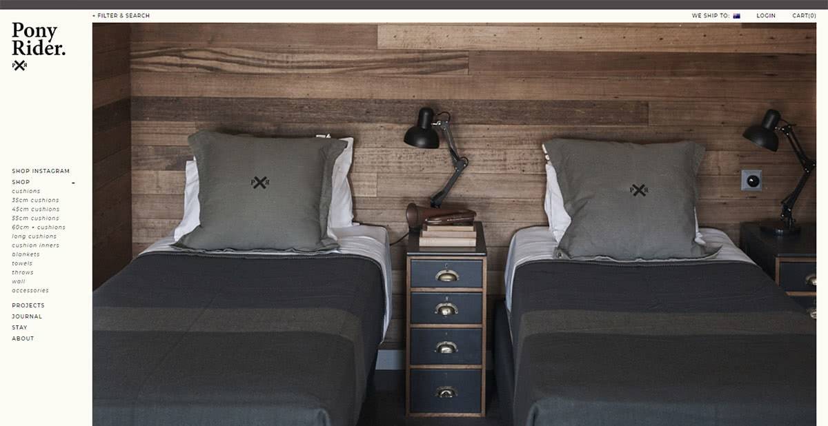
When it comes to photography, powerful images give your business and products visual appeal and credibility. From oversized homepage images to detailed product images they all set the scene for your customer experience. And when it comes to product images, more really is more. Let customers see your product on a clean white background but also show it in use and in a detailed, up-close-and-personal shot.
We can’t go past Neto ecommerce website, Pony Rider as inspiration for how to use powerful images effectively in a website. Designed by one of our Neto Partners, Toolbox Designs (who we recently featured for their work on the Gritty Pretty website), they use big, professional photographs on every page to showcase their story and their products but more importantly to inspire their customers – who wouldn’t want to ‘get the look’ of some of these amazing locations and gorgeous models? Just take a look at their blog and any one of their beautiful product listings. We also love the slightly imperfect presentation of products that gives their brand a sense of real-ness.
| Related Reading: The Importance of Using Professional Photography for Your Products
You’ve probably heard the term ‘white space’ but what exactly does it mean for ecommerce website design? While it can be a minimalist look, it’s actually more about a clean design that focuses on carefully placing important elements. A website that incorporates well used white space and padding reduces the need for visitors to ‘find’ the information they seek, instead, it’s presented in an easy to understand manner that flows easily.
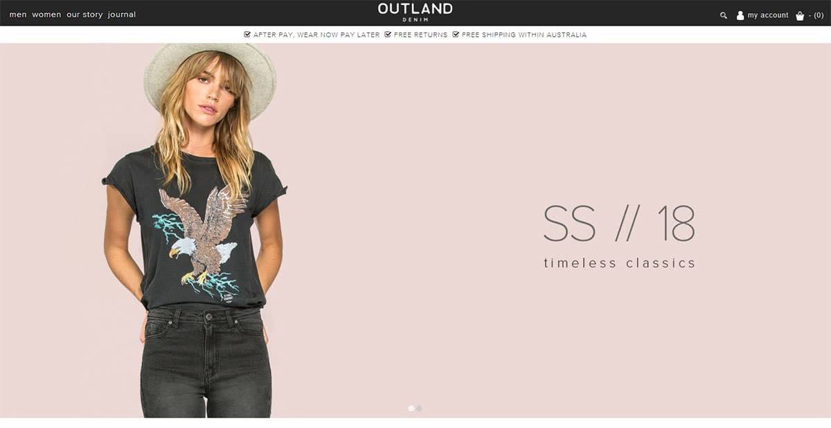
Neto customer, Outland Denim, showcases this design element perfectly. Did we mention white space doesn’t need to be white? It can be any neutral colour in your brand’s pallet and will even work as a text block on a black and white image. Even their unique selling points are simply presented as a banner at the top of the page. Similar to Pony Rider, they also tick the box for strong imagery and they use especially large photographs to fill their home page.
| Related Reading : The Best Clean Designs as Selected by Awwwards.
White space and imagery are all very well but professionally written copy is obviously vital in getting your message across and informing your customers about just how your product will meet their needs. You need to use your brand voice – tone and language that is true to who you are and enforces the image you’re portraying. From telling your story through to listing your product features and benefits, your brand needs to be infused throughout.
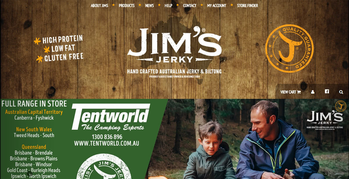
Neto merchant Jim’s Jerky presents a website that uses earthy tones and relaxed images that reflect life in the great outdoors. But as you look a little deeper you’ll notice the language is casual, friendly and quintessentially Australian, just like their brand. Pony Rider also does this really well in their product descriptions, which read more like your cool designer friend talking to you, and adds to the brand’s authentic feel. Outland Denim dedicates valuable home page real estate to telling their story of sustainability and ethical practices, which are core brand values.
Watch the full story of how Jim built his business, Jim's Jerky from the ground up.
As for your product listings, use informative product name descriptors, bullet points to ensure details are easy to follow, and always include shipping and in stock details so that your customer doesn’t have to go searching for it on a separate page.
When it comes to selecting fonts, it’s best to choose no more than three in total, and two of these should probably be from the same family. Inject a little brand personality into your headlines but ensure the rest of your content is in a familiar standard font so that customers can read the information quickly, easily and without having to think too much.
Mater Baby Products do this exceptionally well. Their header font is beautiful yet clear and easy to read and is consistent from their website right through to their product packaging. Created by one of our Neto Design partner’s, NKDC, they’ve also selected an easy to read font for the rest of the website, surrounded by perfectly proportioned white space.

We also think Jim’s Jerky has selected some great fonts that fit their brand personality perfectly.

Eye scanning technology has revealed a lot about the way we view websites. We tend to consume content in an F pattern starting in the top left then moving across and down. We’re also drawn to neatly arranged grid-based patterns.
PACKQUEEN stock over 4,000 products and have customers ranging from online retailers and gifting suppliers to boutique food distributors, so their website has to be many things to many people. Their website design nails this challenge by communicating their product categories and loads of information via a grid based layout that’s easy to understand and navigate. This site was actually designed by our in-house Neto Design team.

And when you consider that Mater Baby Products is designed for new mums, the most time poor of all target markets – the F pattern and grid layout makes their website incredibly easy for customers to find what they need.
While a beautiful website can do great things, UI design elements are only part of the story. Watch this space for part 2 of our ecommerce website design focus as we cover off UX features and focus on functionality.
Can’t wait? Here are a few other articles to keep you going in the meantime:
